|
Background Adjustments with Match Color
|
|
By Rick Wetzel
One of the new features in Photoshop CS is Match Color. It's found under the Image>Adjustment menu. What I love about this new color correction technique is that you can marry two images and make the marriage look great - even if these images, at first glance, seem to clash. The following tutorial demonstates how you can manipulate a background texture and make it harmonize with the foreground subject.
|
|
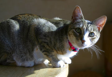 |
This photograph of my cat Gracie is a perfect example of an image in need of a new background. After removing an out of focus electical outlet and part of a chair, I wasn't really happy with the result.
|
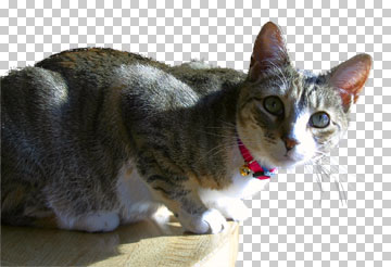 |
I silhouetted my subject using the Extract tool and manually cleaned up the edges.
|
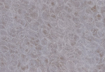 |
I chose this background image from the Digital Pastels CD because I liked the fun swirls of color on textured paper. It was a nice contrast with Gracie's short hair.
|
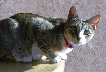 |
But when the new background layer was created, using the pastel that I thought would be perfect, I was disappointed. It was too pink, or was it purple? Rather than using the standard Photoshop Color Balance tool ( which is great if you know what you are looking for ) I chose the Match Color adjustment dialog tool. |
|
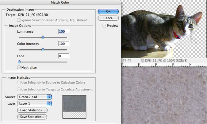
With the background as the active window, I selected Image>Adjustments>Match Color. The background becomes the Target of this adjustment. In the Image Statistics section, I selected Gracie as my Source. I've left the Preview button unchecked so you can see the before. Now comes the cool part. Photoshop CS averages the color in the Source and applies that adjustment to the Target. I could have selected just Gracie's collar and checked off the appropriate check box, but I opted for a more subtle adjustment and used all of her different colors.
|
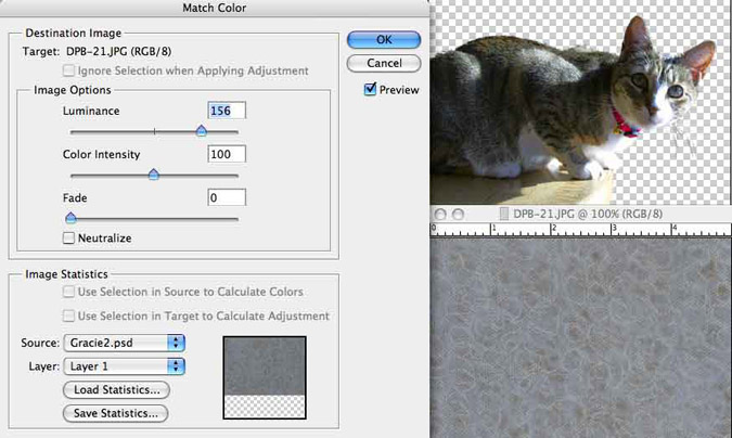 |
With the Preview option selected, I made one small Luminance adjustment. The background seemed a bit to dark.
|
 |
What a difference! The background color now works, the pink tones are gone. It's harmonious and isn't distracting. |
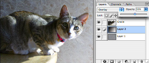 |
As a final touch, I created a third layer (layer 2) with a black to white blend to simulate the existing light. I set the adjustment layer to Overlay and 55% Opacity.
|
|
| Now, with Photoshop CS's Match Color, your background choices are limitless. Have fun! |